How Retailers Use Design to Combat Online Competition
Technology dominates our world, forcing one industry after another to transform itself. And now it's the retail trade's turn. So which strategic devices have the most innovative retail brands been employing in their stores to strengthen their position and physical presence?
This article will look at the strategic devices that innovative retail brands are employing to redefine their stores to meet the challenge presented by online shopping. How do they meet the challenges, and how do they seize the advantages and opportunities of having physical premises to help them build stronger customer bonds?
In the first part of this article, we will focus on how the physical space is being used in new ways to establish emotional bonds with potential customers. And how, through the clever use of technology, service, and experiences, a shop can be turned into something much more than simply a place you go to buy things.
In the second half of the article, we will turn our attention to which of these strategies we adopted when we were asked to develop an entirely new shop concept for Narvesen, Norway's largest chain of convenience kiosks, and we will take a look at what the results have been.
It All Began with Music
The music industry was the first to be challenged and has remained in a state of dramatic flux. To begin with, it had to fight off a “coup” from illegal file-sharing sites such as Napster, then came Apple and iTunes, followed by Spotify, and today, contenders such as Tidal and Amazon Prime are fighting for their piece of the pie. A range of other industries have changed for good or are being challenged by new business models that apply technology in new ways. The most well-known examples are Uber’s entry into the taxi trade and AirBnB’s alternative to the traditional hotel.
Learn how new market players are disrupting the economy.
It may have taken longer than many expected, but online shopping has at long last become commonplace. Better websites, easier payment methods and smartphones have all enabled online shopping to appropriate part of the high street market.
"Brand identity goes beyond simply selling products."
Shopping on the net is practical and simple: you can sit in your own home (or on the bus on the way to work, for that matter), make a few clicks, and your purchase is on the way. Many products can also be sold at a more reasonable price: they can be purchased from abroad and sent directly from the warehouse to the buyer without the supplier needing to spend money on rent and expensive premises. Last but not least, the internet makes the choice infinitely large, and everything is accessible, straight from your pocket.
Brand identity goes beyond simply selling products, though. Physical premises will always be necessary for many trades because they offer the possibility of a more personalised human interaction. Goods can be touched, tried, tasted and customised.
What do we really mean by brands, identity and logo? You'll get the answer here.
A clothes shop lets you try on garments to know whether they are comfortable to wear, how the material feels, and whether they will suit your body shape, all things that are still difficult to gauge when buying online. A bakery is enticing with its smell of newly baked bread, buns and cakes. You can compare produce close up to buy the most appealing, and best of all – it can be enjoyed immediately.
The majority of us shop according to our emotions and subjective points of view, often to a much greater extent than we realise. So a shop can dramatically influence our shopping choices and attitude towards the product in question through the experience it delivers through its interiors, product range and service.
Customer experience
The challenge lies in luring people away from their smartphone or laptop and into the shopping street again. But it's not enough to have a nice location. We want a purpose, a history, a reason to be engaged, an experience. Why would I go there when I can buy the same goods on my phone while sitting in a comfy chair? One of the businesses that do really well within retail and physical locations are coffee bars. They pop up all the time - in a lot of variations — small local ones like Kaffebrenneriet and larger chains like Espresso House and Starbucks. We love to visit coffee bars, and we drink more coffee than most. Numbers show that Norwegians drink the second most amount of coffee in the whole world!
Norwegians come in second place in coffee drinking in the world
Hot coffee and warm freshly-made waffles still cannot be bought online, but this is not the main reason why this business thrives. It's also a fact that there has been no dramatic revolution regarding coffee as a product. It's more the experience which is the real difference. It's the lovely smell, the products you can see and taste in pleasant surroundings.
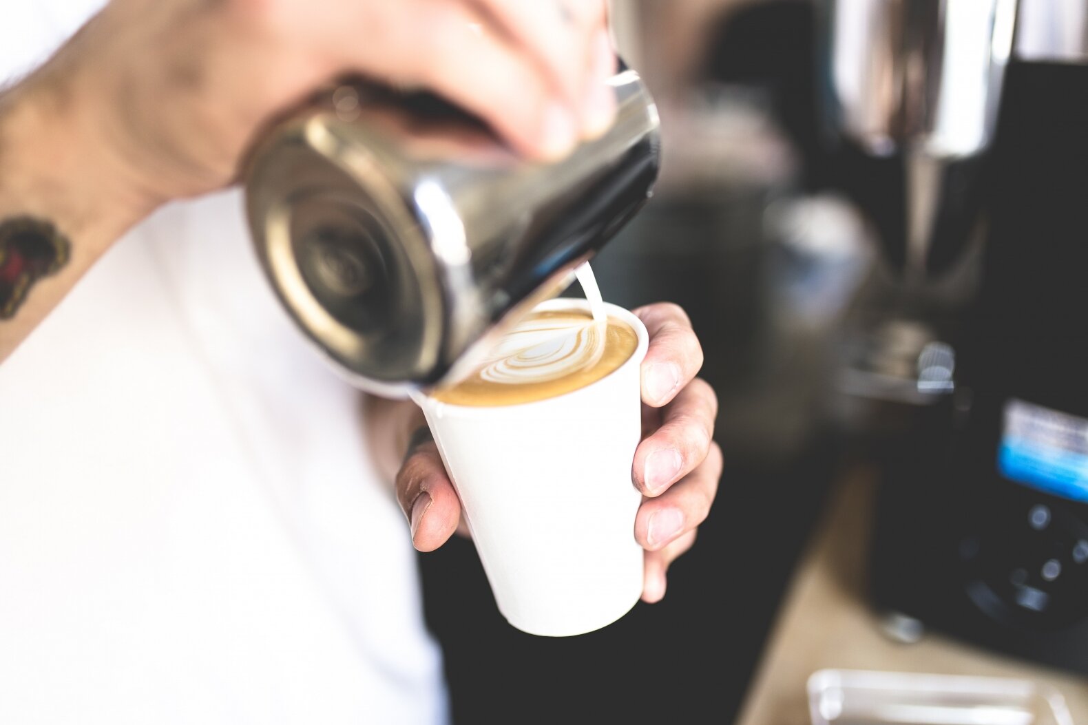
It's the social part of going to a café with friends and other people. It's the experience of seeing a skilled barista go through the ritual of grinding the beans, brewing the espresso, steaming the milk and at last, like a Buddhist in his zen garden, with a steady hand and soft movements, pour the milk foam until it finally and magically forms a perfect heart.
Create great customer experiences by following six easy steps.
Coffee bars are unique also because we spend relatively long in these places compared with ordinary shops. That's why it is more and more common, especially in larger cities, that the shops also have a coffee bar for their customers.
Size Matters
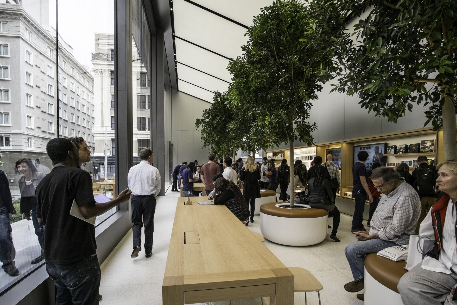
Another trend is to use their premises for other activities that are not directly related to sales. For example, Apple has opened two new megastores where large parts of the store are "hangout zones" where you can mingle with like-minded people, as well as get help with any questions you may have about the products.
"We want a purpose, a history, a reason to be engaged – an experience."
The same areas are being used for concerts and free workshops. The focus is turned away from selling and onto interaction with the customer through experience and service.
Technology dominates our world, forcing one industry after another to transform itself. Now it’s time for the turn of the retail trade. Which strategic devices have the most innovative retail brands been employing in their stores to strengthen their position and physical presence? Let's look closer at some options:
The new Apple flagship store in Union Sq, San Francisco
Choice
No shop can compete with the internet when it comes to the choice of goods available, but is that necessarily a weakness? On the contrary, it could be a shop’s strength. Choice presents a challenge for many people. It can be impossible to get a good overview and difficult to differentiate quality from rubbish.
"A good shop will act as a curator."
A good shop will act as a curator and do the job for you, removing the clutter you don’t need and presenting a precisely planned selection of goods of the desired quality at the desired price
Focusing on fewer things and making sure that they are of the best possible quality makes life easier for the customer. Retailers can present themselves as experts by having a stronger focus on one type of product. When Steve Jobs gained control of Apple in 1997 he made a drastic reduction to its product line, cutting out more than 70% of products in order to make the rest as good as they could be.
"Deciding what not to do is as important as deciding what to do."
–Steve Jobs
Local
The internet is accessible to everyone everywhere, so being limited to a physical location and the people living there could be seen as a weakness. However, the possibilities for engaging and interacting with the customer base are much greater in a physical store.
By becoming part of the local society and offering experiences and other forms of interaction, a retailer can attract a strong following and establish a community and culture of its own.
Several large and small brands build strong relationships with their customers by using their shops to stage events, workshops and pre-sale experiences. Apple encourages customers to stay longer in their new stores by offering concerts, workshops and lectures by professional musicians, designers and app developers.
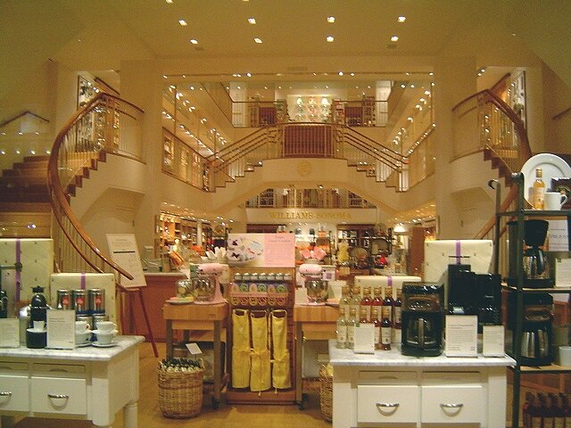
Another example is the Williams Sonoma chain, which sells kitchen equipment. Their focus is not on products and prices, but on food. Food is the focus of all marketing, and the shops are used to celebrate the joy of food.
Cookbooks and dry goods are purchased alongside cooking pans and knives, and there is often a kitchen island in the middle of the shop where food is prepared and offered for tasting. Moreover, the shop is regularly used for holding cooking and wine tasting courses and other activities.
There's no doubt that the focus is on food and cooking at Williams-Sonoma.
There's no doubt that the focus is on food and cooking at Williams-Sonoma.
Technology
Technology is not just advancing online. New and exciting things are happening in stores too. Several players have developed apps to build stronger bonds with their customers through discounts, loyalty bonuses and special offers.
The use of digital screens to show animations and marketing campaigns has risen sharply, and interactive screens that let you customise products or browse those that are not on display are also increasing.
Smart mirrors let you put together the perfect outfit.
One of the most advanced examples is an interactive touch mirror appearing in changing rooms where it doubles up as a digital screen. Equipped with a camera and sophisticated software, it can show you images of other colours and designs of the garment that you are trying on. It can also suggest other clothes to go with what you are wearing.
You just need to choose a size and the shop assistant will bring it to the changing room for you.
With smart mirrors you can easily try on outfits in different colors.
The software can also record a video or take photos of you to show you how the garment looks from the back, or compare it to another garment you tried earlier. The photos and video can also be shared on social media or sent to your private e-mail.
Moreover, the mirror can recognise the faces of customers who have been there before and recommend new products based on the garments they have tried on previously.
Another technology creating a good deal of interest is that of beacon technology. These are small battery-powered wireless devices situated in various positions around the store that give out a bluetooth signal. An app on your mobile will be able to locate your position in the shop and based on that information, will make recommendations, and point out offers and discounts.
For this to be successful, retailers need to work out how and to what extent they wish to interact with their customers to create a positive and engaging experience without coming across as over-intrusive.
Traditional shops have felt the pressure and competition from online shopping, forcing several large chains to close shops and cut costs. But, at the same time, we are seeing a range of innovations and new initiatives that take the development seriously and redefine the shop’s role towards its target group.
Below we will look more closely at which of these measures we used when we were asked to develop a completely new store concept for Norway's largest kiosk chain, Narvesen, and what the results have been.
Successful Strategy for New Retail Design: Narvesen
When Reitan Convenience needed to develop a tender for Oslo Airport in 2015, they competed against many of the world's largest and most resource-intensive chains.
Narvesen kiosk at Majorstuen in Oslo
In May 2015, we were asked to assist Norway's largest convenience chain, Narvesen, with a bid they were submitting to Oslo International Airport (OSL) to compete for the best sites in the new airport terminal. The end result of this exercise proved to be more far-reaching and comprehensive than anyone had imagined and led to a new identity and a completely new retail design.
The result was a completely new identity for Narvesen and a newly developed and innovative store concept .
Traditional stores are increasingly being challenged by online shopping. Slowly but surely, we are becoming safer and more comfortable shopping online, whether on a laptop at work or on our mobile phone on the bus home. The effect of this is being seen among large retail chains that are being forced to close stores and cut wages.
But online shopping will never be able to completely replace the experience we get from shopping in an actual store. It can’t duplicate the smell of a bakery, nor the experience of testing out a bed or trying on a pair of trousers before buying.
Also, large and small brands alike appreciate the role that a shop can play, not just by selling its products but also by interacting and building strong bonds with its target customers.
We have also noticed that the physical space today is used in new ways to establish emotional ties to potential customers, and how through experiences, service and technology, you turn a shop into much more than a place where you buy things.
The Strategies
Let us take a closer look at the strategies we employed to redefine Narvesen’s retail concept from the bottom up. Everything from identity and communication to interiors, store layout, signage, and frontages were redesigned upon a new strategic platform focussing on experience, quality and effortless effectiveness.
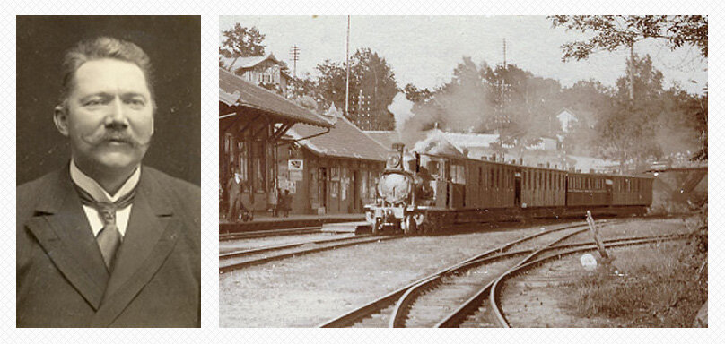
Bertrand Narvesen, founder of the brand, back in 1884.
Narvesen’s Position
From the beginning, in 1894, when the first kiosks were opened at railway stations in Eastern Norway, Narvesen made the strategic decision to be where people travel to and from. Ever since, it's been important for Narvesen to be located near traffic hubs.
When measured against the competition, they have also managed to maintain a strong focus by offering a quick and efficient transaction process, which is vital when selling coffee to busy commuters on the way to work or sausages on the way home. In that regard, they score better than everyone else, so that became an important starting point when developing the new retail design.
Narvesen is also perceived as reasonably priced but at the same time unable to compete with the country's leading grocery chains. Narvesen offers a wide selection of products across numerous categories, putting it in competition with some sectors, not just with grocery stores and other convenience chains such as 7-Eleven and Deli de Luca, but also with cafés, pharmacies and bakeries.
New competitors are constantly popping up with tempting offers and attractive stores, while Narvesen’s stores reflect, in many instances, a concept which has been touched up and adapted over a long period, often by local shopkeepers employing whatever means they can to maintain their sales figures.
This has resulted in several Narvesen shops having a somewhat random appearance, dominated by a myriad of posters showing price offers and poorly thought-out interiors. Sales campaigns with strong colours and reasonable prices have a measurable effect on sales figures, and shopkeepers are quick to use up empty space to display ever more – and larger – posters.
New designs for various products sit together with outdated interiors. Big names such as Coca-Cola and Diplom-Is have sponsored freezer displays and other equipment that take up valuable floor space. This process has been going on for some time, while the identity of the Narvesen brand has not been measurably updated since 1980.
This situation, combined with the increasing competition and new modern players, has resulted in Narvesen’s brand losing ground and dropping in people’s preferences.
This development has continued over time, and the Narvesen brand has not made major updates to its identity and brand since 1980. Combined with increasing competition and new modern players, Narvesen's brand has suffered losses and declined in people's preference.
Solution
When we began work on the OSL Gardermoen bid, we reached a swift agreement with our client that drastic measures needed to be taken. Producing an elegant document with pretty pictures would not be enough to make the required impression. Furthermore, the competitors they were up against were large international brands specialising in this type of shop.
Oslo Airport Gardermoen with the expansion completed in 2017.
Narvesen as a brand was seen as sturdy but stagnant, and it was decided this was a golden opportunity to take a look at the whole picture. Upon that basis, the case was made for undertaking a complete redefinition of Narvesen from A to Z.
Keeping in mind OSL’s ambition to become “A gateway to Scandinavia,” we defined our esthetic starting point based on the idea of Scandinavian simplicity. A balance between forward-looking minimalism and naturally warm materials became the touchstone for the new look.
"Narvesen has always focused on locations where people are on the move."
At the same time, a strong emphasis was placed on protecting and strengthening Narvesen’s ever-present strategic base, namely that of always focusing on locations where people are on the move – one reason why it is natural for them to be located at an airport.
Their strength is that they have always been seen as somewhere you can get what you want quickly and efficiently. This strength becomes even more significant at an airport where there is a range of alternatives for travellers if they have a bit of spare time on their hands. This was the basis for the retail concept, which became a strong reference point for the solution as a whole.
A New Brand Identity
The last time the identity was redesigned was in 1992, and today, 25 years later, Narvesen is seeing a thorough upgrade of both the identity and the retail concept. Let's take a closer look at some of the features of the new identity and store concept.
Design of new logo store sign.
Open
The stores were designed to be more open and airy than normal to make it easier to enter and move through them.
3D model of new shop layout.
Sightlines and movement patterns
Sightlines and customer flow in kiosks.
Shelves and other interiors were organised in a particular way for easier navigation around and orientation within the stores. Products and product categories were placed in relation to speed zones to enable those customers with the least amount of time to acquire the most critical things as quickly as possible.
Clear Categorisation
Chiller cabinets and produce shelves were built into walls and marked clearly with signs at the top edge for easier orientation.
Express Tills
As part of the emphasis on customer flow, self-service points or express tills, where customers can pay for products themselves, were installed.
“The sum of these elements creates a much simpler customer experience.”
Light Path
To enhance the feeling of flow and to guide visitors through the store, a “light path” was designed for the ceiling. This is a strong visual and dynamic element that also gives Narvesen a distinctive character.
All of these elements combined result in a more effortless experience for the customer, whether they are buying a bottle of water before running to catch a flight, or browsing through books to pass the time between flights. The concept was delivered using a combination of animation and physical models designed to help the bid committee fully appreciate Narvesen’s ambitions.
Future Visions
Apart from the retail concept and the functional and esthetic choices made for the kiosk's interior, we have also worked out a new flexible signage system that focuses on the new symbol and gives Narvesen a more modern and distinctive character.
An image of how the new Narvesen flagship could look like.
The facades are more than just windows and signs. As a follow-up of the retail concept and the new visions that we have put down for Narvesen, we had the opportunity to develop some ideas for key locations in the centre of Oslo.
One of them is the kiosk at the National Theatre in central Oslo. At this junction, surrounded by busses, trams, and the metro, there are also a lot of people. We have a vision of something more than a great kiosk here, namely an urban city block that organises this area for everyone who uses it. We have even made space for a roof garden where people can wait in calm surroundings, shaded from the hustle and bustle of travellers and others.
Not only a kiosk, but a place to meet.
"We are all extremely intrigued with the new retail design and with Mission’s invaluable contribution in connection with this rare business opportunity. The new concept makes us a more attractive partner, it opens new doors, gives us power to perform and propels us into action."
–Stian Breivik, Marketing Manager, Narvesen
Result
The project has solidified the Narvesen brand. The concept was well-received by Avinor, who, following a comprehensive process, selected Narvesen ahead of 80 global players as its leading convenience chain.
These are some of the results of the rebranding:
A contract for 6 units has been secured for key locations at the airport Oslo Lufthavn Gardermoen to a value of 2.1 billion Norwegian kroner (255 million US dollars)
Another 4 units are won at Bergen Flesland lufthavn, to a value of 700 million kroner (84 million US dollars)
30 units connected to Sporveien's lines have a value of 2.9 billion kroner (350 million US dollars)
In total, contracts for approx. 5,7 billion Norwegian kroner has been secured for Reitan Convenience (687 million US dollars)
The retail design was tested and developed further following the bid's success. As a result, the bids for Flesland and Evenes airports in Western and Central Norway were won on the basis of variations on the same concept, and stores at Majorstuen, Karl Johans Gate, The National Theatre, Tøyen, other districts of Oslo and other places have been drawn up and are under construction.
The first pilot stores show very encouraging results, with sales per customer up by 17% and total sales up 30%. That means that more people are coming into the store, and that they on average using more money than before.

